Metrics
Real-time metrics offer insights into your application's behaviour and performance across different environments. Each application environment displays its metrics separately.
Understanding metrics display
The metrics system aggregates values over time. When zooming in, values are distributed across more granular data points, revealing the actual peaks at specific moments. When zooming out, multiple peaks are aggregated, which may result in seemingly higher values.
Metrics are displayed by container type, such as web, cronjob, worker, and beat.
Use the legend below each graph to:
- show or hide specific container types
- compare behaviour across container types
- temporarily focus on a single container type by hovering over its label
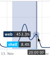
When hovering over a container type in the legend, the selected container type is highlighted while the remaining graph data fades into the background. This makes it easier to visually isolate a specific container type without fully hiding the others.
Hovering directly over a graph element, such as a bar or line point, displays the metric value for the selected container at a specific moment in time.
These interactions work consistently across all metric graphs.
In each graph, vertical lines denote deployments:
- green for successful deployments
- red for failed deployments
Deployment markers can be enabled or disabled using the Show deployments toggle in the lower-right corner of each graph.
Spikes occurring alongside these lines typically indicate deployment-related activity.
Additionally, spikes without accompanying deployment lines may indicate that runners are being recycled or moved between infrastructure nodes. During such processes, both old and new containers may temporarily run simultaneously, potentially leading to short-lived increases in resource usage. These fluctuations are expected during deployment and maintenance activities.
Memory metrics
Memory metrics show memory usage by container type over time.
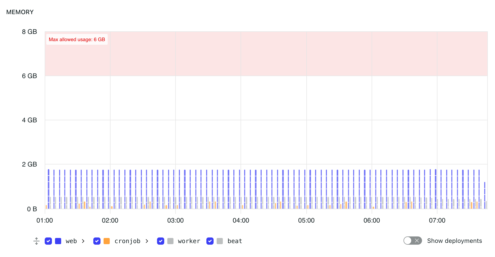
Memory metrics show memory usage for containers in an environment.
Each container type, such as web, cronjob, worker, or beat, is represented separately in the graph. This makes it easier to identify which containers are using memory.
When multiple containers exist for a container type, the graph can show individual container values. Hovering over a bar displays the container identifier, timestamp, and memory usage for that point.
The shaded red area indicates usage above the maximum allowed memory limit for the environment. Both the maximum available RAM and the number of instances running in an environment can be adjusted in the application subscription settings.
If memory usage reaches or exceeds the limit, there is no guarantee that the processes running in the affected containers will continue to run correctly.
CPU metrics
CPU metrics show CPU usage by container type over time.
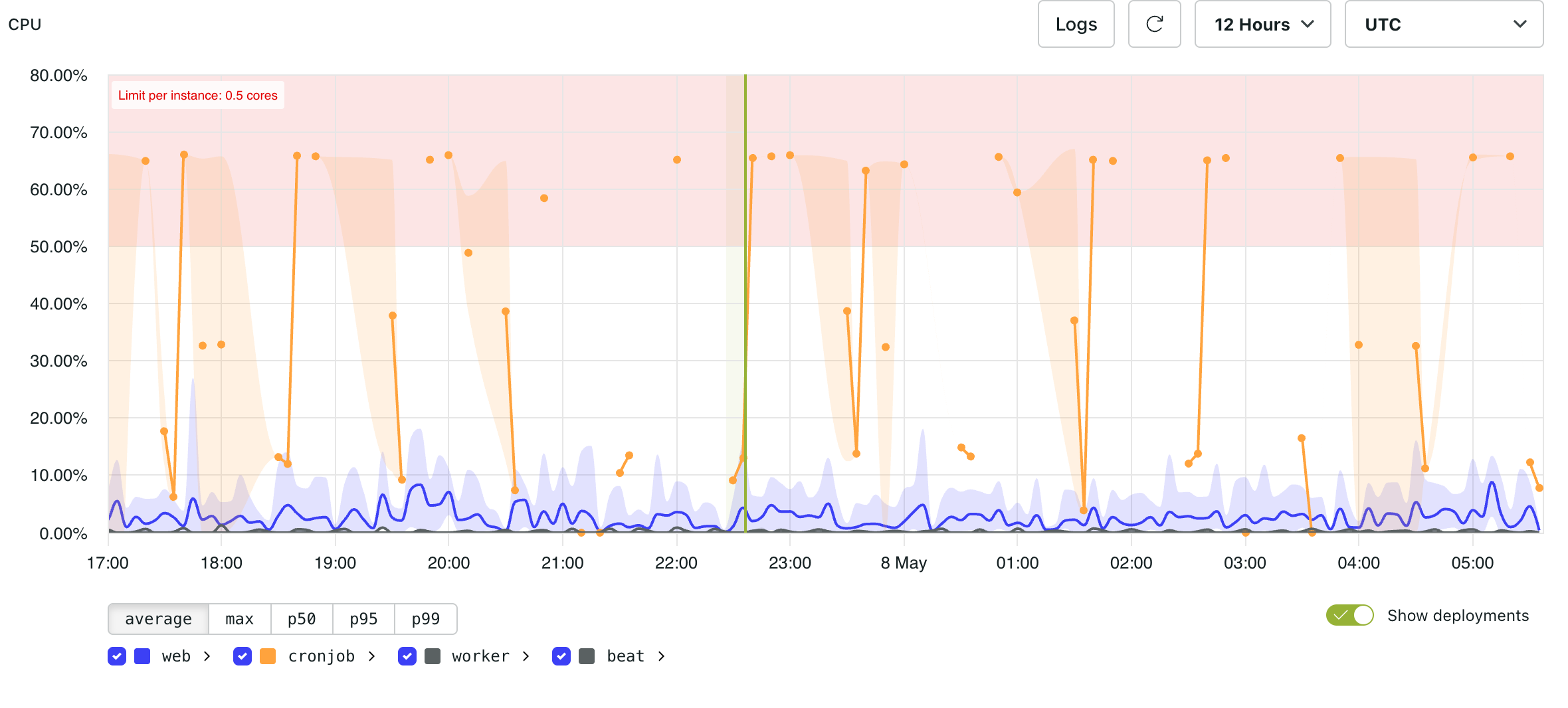
CPU metrics show CPU utilisation for containers in an environment.
Each container type, such as web, cronjob, worker, or beat, is represented separately in the graph.
The shaded red area indicates usage above the CPU limit for the environment.
Since CPU metrics are aggregated over time intervals, zooming out can smooth or combine short-lived peaks. Zooming in provides a more precise view of CPU usage at specific moments.
As CPU usage approaches resource limits, application performance may decline. Excessive CPU usage can lead to slow responses, dropped connections, or unresponsive requests due to insufficient resources.
HTTP count by status
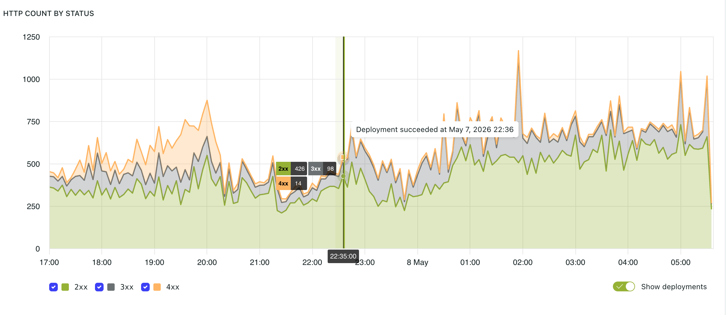
The HTTP count by status graph displays request volume grouped by HTTP response status code.
Common status groups include:
2xx— successful responses3xx— redirects4xx— client-side errors5xx— server-side errors
Monitoring status code distribution helps identify changes in application behaviour.
HTTP request count by host
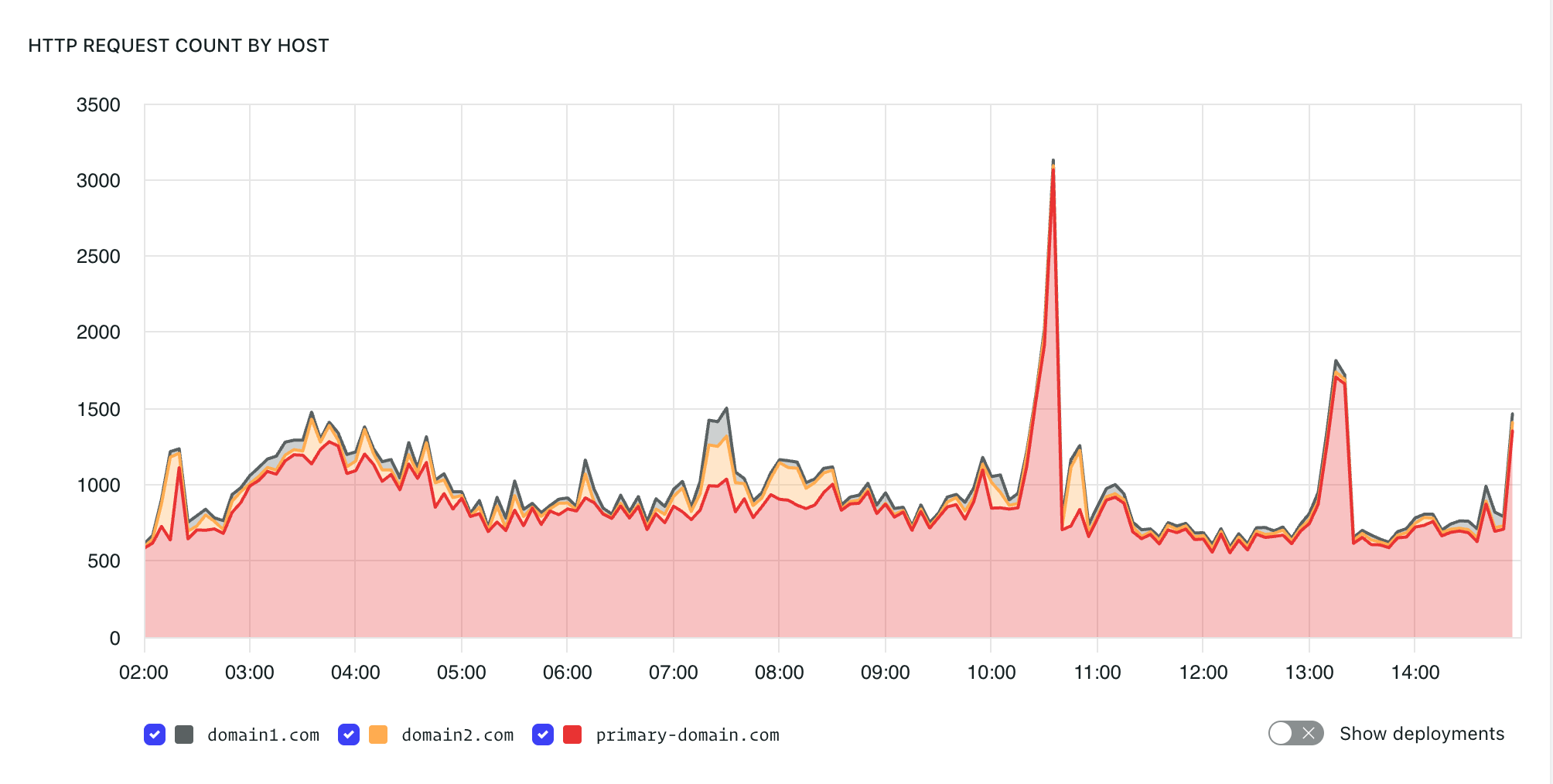
The HTTP request count by host graph displays request traffic grouped by domain.
This can help identify traffic changes between domains.
HTTP response time
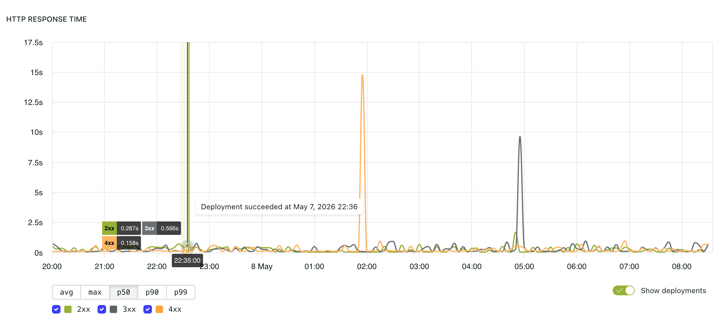
The HTTP response time graph displays application response latency over time.
Available views include:
avg— average response timemax— highest response time in the selected intervalp50— median response timep90— response time below which 90% of requests completedp99— response time below which 99% of requests completed
Higher percentiles help reveal slower requests that may not be obvious from average response times.
Temporary spikes during deployments or infrastructure events can be expected. Sustained increases in p90 or p99 may indicate performance bottlenecks.
Slowest 25 requests
The "Slowest 25 Requests" table displays the 25 slowest recently observed requests in the environment.
The table includes the request path, median response time (p50), and request count.
Database size
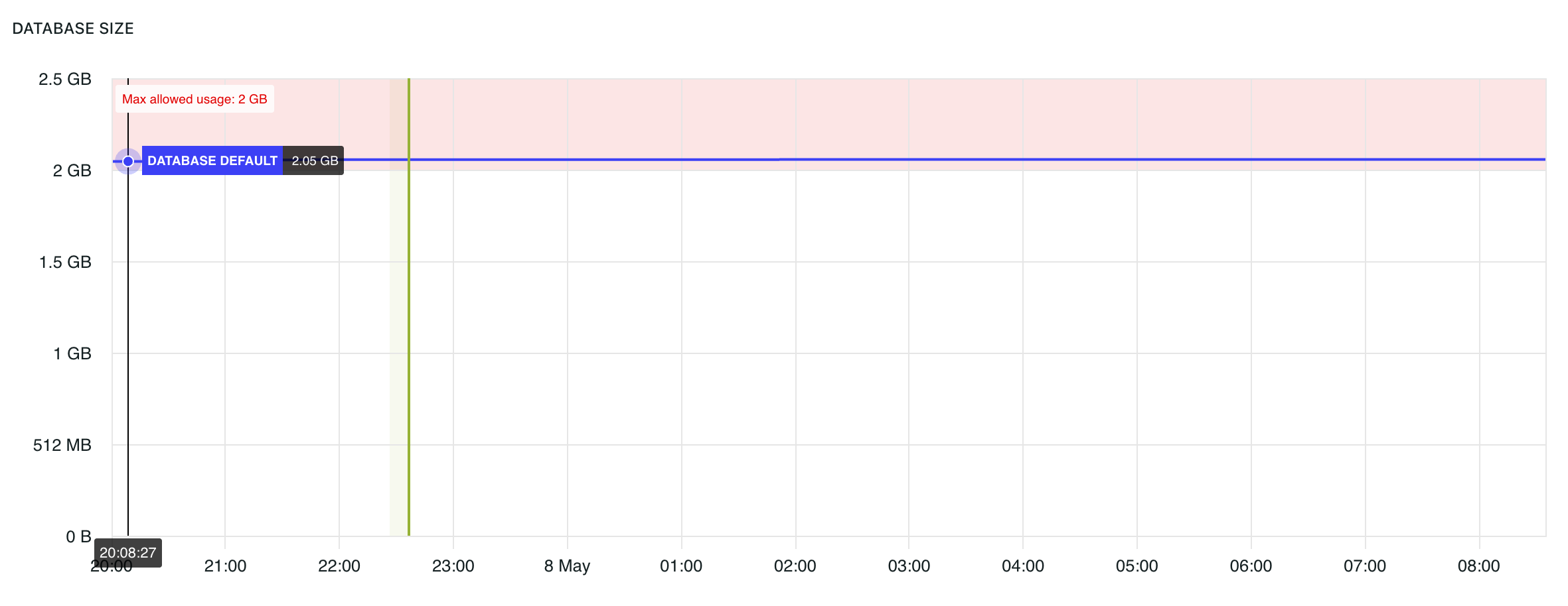
The database size graph tracks database storage usage over time.
The shaded red area indicates usage above the maximum allowed database size for the environment.
Object storage size
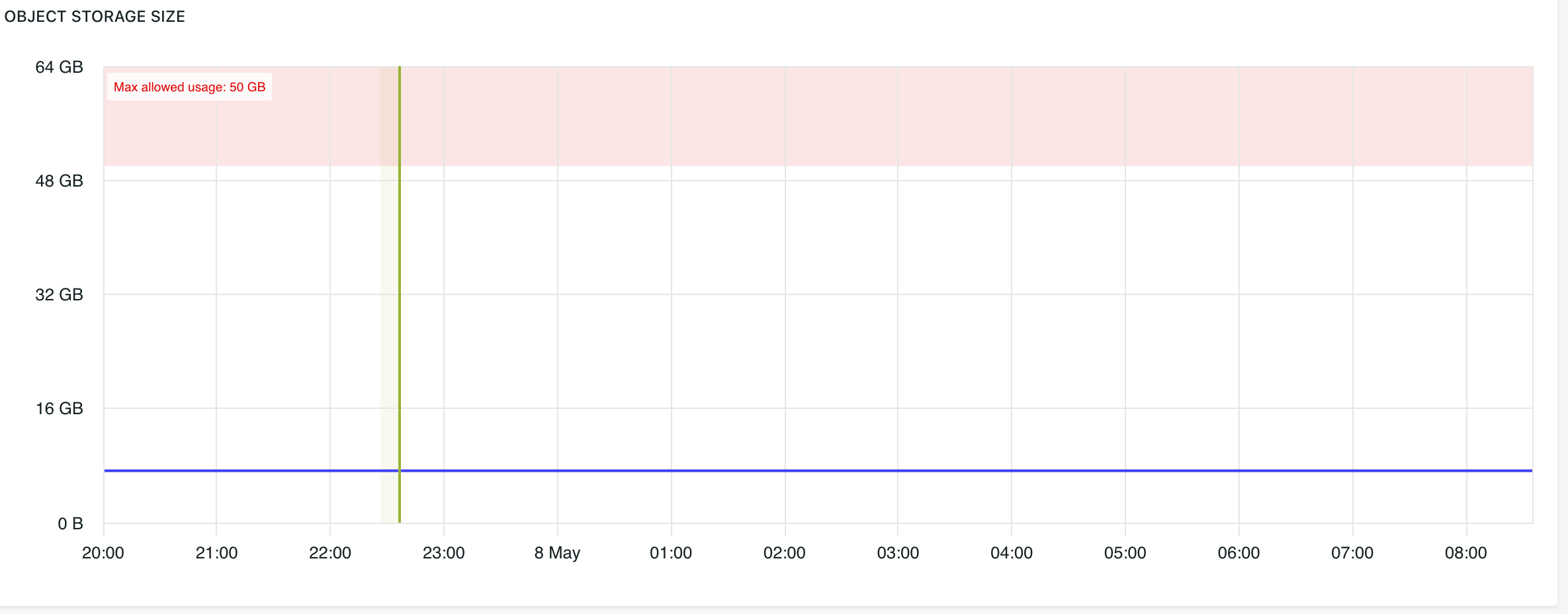
The object storage size graph tracks uploaded file and asset storage usage over time.
The shaded red area indicates usage above the maximum allowed object storage size for the environment.
Availability and support
We provide SLAs to help monitor and address infrastructure and performance-related issues, helping to minimise unnecessary downtime.